With us both running two (in Erin's case three!) blogs on top of everything else a diary is a must have, but it can be really hard to find a pre-made diary that can cater to our specific needs, and this is where Personal Planner come in.
These cute, handy and high quality planners are completely customisable and are packed with tons of great optional features. Here's what we came up with when we were let loose on the website!
Erin's Planners*
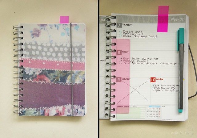
For my notebook planner I chose to use one of my own photographs on the cover instantly making it a one of a kind! For the inside layout there are four different options so you can tailor it to suit you. I think these little notebook planners would be great as general day-to-day dairies however I have been using mine as a sort of ‘blogging to-do list’, noting down little tasks I need to remember to get done each day. So, I opted for landscape sections for the weekdays with smaller sections assigned to the weekends. For the back section of the planner you can choose from a variety of options including square/ruled/blank pages, sheet music, colouring pages, sudoku, maps, yearly calendar overviews and more!
Most of all I really loved being able to choose how I wanted almost all of the planner elements to look. From the cover to little features such as space to record your workouts or the weather and even the colour of the elastic closures and handy detachable rulers, you can easily create something that’s unique to you and your lifestyle.
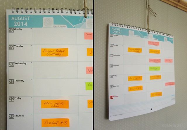
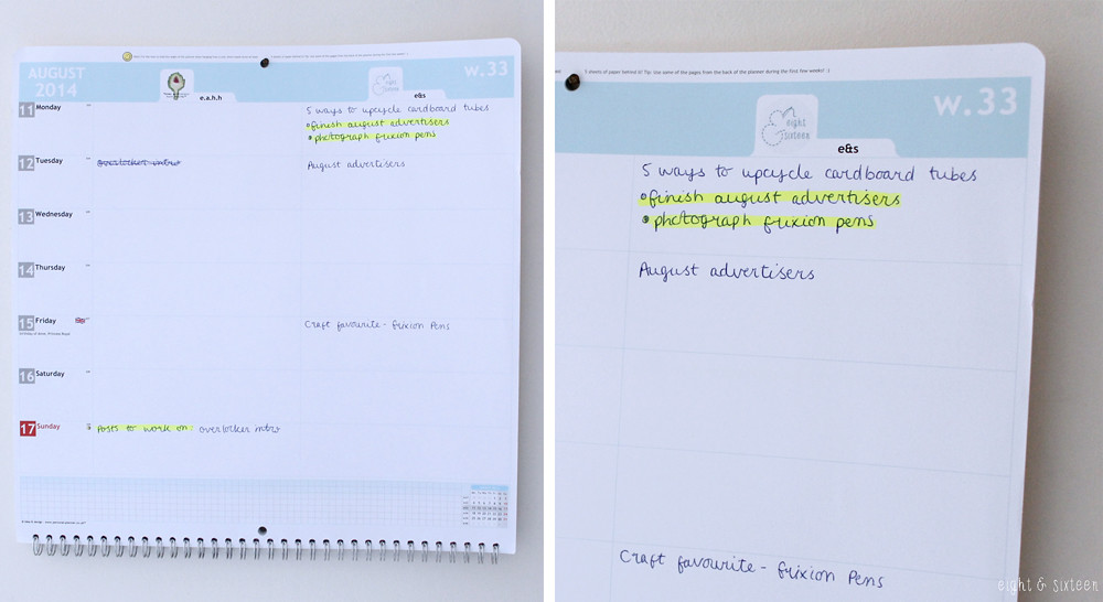
Similarly the wall planner is also fully customisable although this time I opted for one of the pretty pre-made designs for the cover and page details. The best feature of the wall planners has to be the fact that you can add multiple columns each with their own title and image. As I’m using the planner for blogging I assigned each blog I write for it’s own column and have been using post-it notes to give me an overview of my upcoming schedule when I’m away from my laptop. Not only is this design great if you run multiple blogs but it would also be brilliant as a family calendar as each person could have their own column!
Skye's Planners*
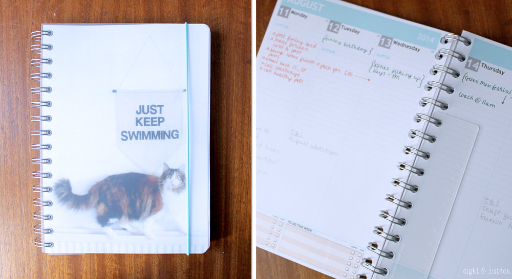
Just like Erin, I chose to use one of my own photographs for my Personal Planner. I love the option to do this as it instantly makes the diary feel like mine, and it definitely makes me smile when I see it!
For my diary I wanted to be able to create something that could act as both a personal diary and a blog planner. I checked out each template option on the website to see which layout I thought would work best for this and in the end I went with a vertical weekly layout and added the option to have half of each day lined and half left plain. This means that I can jot down all personal bits in the ruled sections at the top of each day, and then I have the bottom half of the day to jot down anything blog related. This layout is already working brilliantly for me!
I then chose squared and blank paper for the remaining pages at the back to be used as ideas/doodles pages and also added a few pages for addresses as I really like to have those in a diary.
I completely agree with Erin about how great a Personal Planner is if you want to create something unique. There are so many options to choose from to make sure that you are creating something completely personal to you, and I think these would also make a really lovely gift!
For my Wall Planner, I decided to keep it solely blog related, so added two columns for each blog. I love the fact that you can add a little photograph to each column - a small detail, but one that really makes this planner stand out. So far I have been writing in all planned blog posts that I have, and then noting in what I have to get done on weekends/evenings and then highlighting the to-do's. I love the way Erin has used post-it notes on her wall planner! The Wall Planner is a great way to see at a glance what I need to get done - in all my excitement with Eight & Sixteen I've noticed a lack of posts on my own blog now that I've started filling out the planner. Hopefully this means I'll be able to keep a closer eye on things from now on!
We'd love to know what you think of our planners, and be sure to check back in the next few days as we will be launching an exciting giveaway in collaboration with Personal Planner!
Erin & Skye
* These planners were kindly sent to us to review, all views and opinions are our own.









No comments:
Post a Comment